LOGO & CREST DESIGN

DESIGNING WITH CHARACTER

LOGO DESIGN

TYPOGRAPHY

COLOR SYSTEMS

LOGO & CREST DESIGN

DESIGNING WITH CHARACTER

LOGO DESIGN

TYPOGRAPHY

COLOR SYSTEMS

LOGO & CREST DESIGN

DESIGNING WITH CHARACTER

LOGO DESIGN

TYPOGRAPHY

COLOR SYSTEMS

THE CLIENT AND THE CHALLENGE

AN OFFICIAL LOOK WITH CHARM

A rec soccer team wanted a crest for their kits, something that looked like it belonged on a real badge, but still felt like them. Most of them were Liverpool FC supporters, and the group had its running jokes and personality that a generic template would have flattened.

GOAL

A BADGE WITH PERSONALITY

Study how professional crests are built, then customize the color, typography, and mascot to reflect who this specific team actually is.

Timeline

1 Week

Role

Logo Designer

Team

1 Person

Tools

Adobe Illustrator

Figma

Deliverable

Logo Files for Print & Social Media

Timeline

1 Week

Team

1 Person

Deliverable

Logo Files for Print & Social Media

Role

Logo Designer

Tools

Adobe Illustrator

Figma

MY PROCESS

DECONSTRUCTING THE PATTERN

1

Study the Pattern

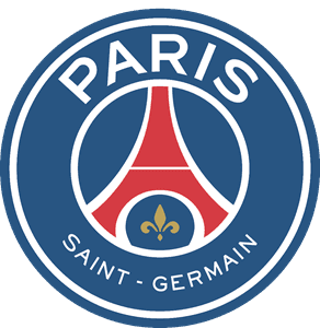
Looked at pro crests like PSG, Chelsea, Bayern Munich and of course Liverpool to find the commonalities: a stroked circle, wrapped text, and a central figure.

Build the Stroke

Started with a simple multi-line circular stroke as the base shape.

2

Wrape the Type

Set the team name in a bold Akira font lining the stroke, with the founding year anchored at each side.

3

Choose the Mascot

Silhouetted three candidate photos tied to the team's own running jokes, then let the group vote. As expected, the humorous "husky" figure won unanimously.

4

Explore Color

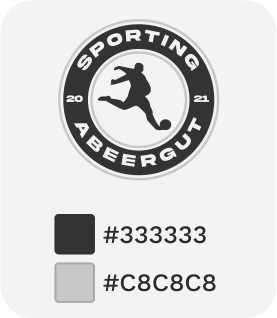
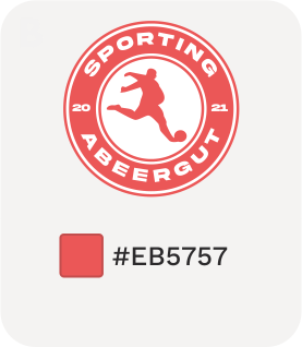
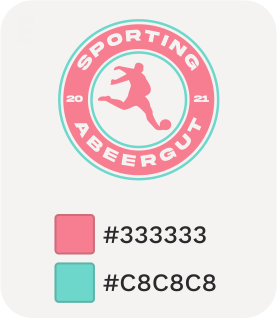
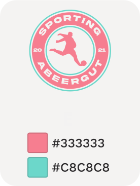
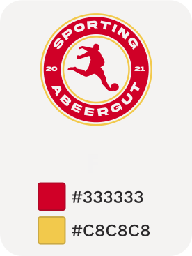
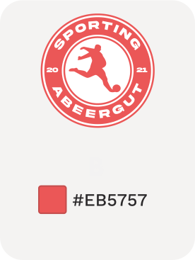
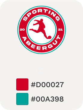
Built six color variations, from a subdued black look to a pastel watermelon, and landed on the watermelon for print and the rich red and green for the social media.

5

MY PROCESS

DECONSTRUCTING THE PATTERN

1

Study the Pattern

Looked at pro crests like PSG, Chelsea, Bayern Munich and of course Liverpool to find the commonalities: a stroked circle, wrapped text, and a central figure.

Build the Stroke

Started with a simple multi-line circular stroke as the base shape.

2

Wrape the Type

Set the team name in a bold Akira font lining the stroke, with the founding year anchored at each side.

3

Choose the Mascot

Silhouetted three candidate photos tied to the team's own running jokes, then let the group vote. As expected, the humorous "husky" figure won unanimously.

4

Explore Color

Built six color variations, from a subdued black look to a pastel watermelon, and landed on the watermelon for print and the rich red and green for the social media.

5

WHAT WORKED BEST

OPTIONS MADE THE CHOICE EASY

Borrowing the structure of professional crests gave the design instant credibility, customization brought out the team's charm.

Starting From a Known Pattern

Three mascot options and six color palettes gave the team something concrete to react to instead of vague feedback.

Presenting Real Choices

Letting the Team Decide

A quick vote turned a subjective call into a clear, unanimous decision everyone was happy with.

RESULTS

A LOGO WITH STAYING POWER

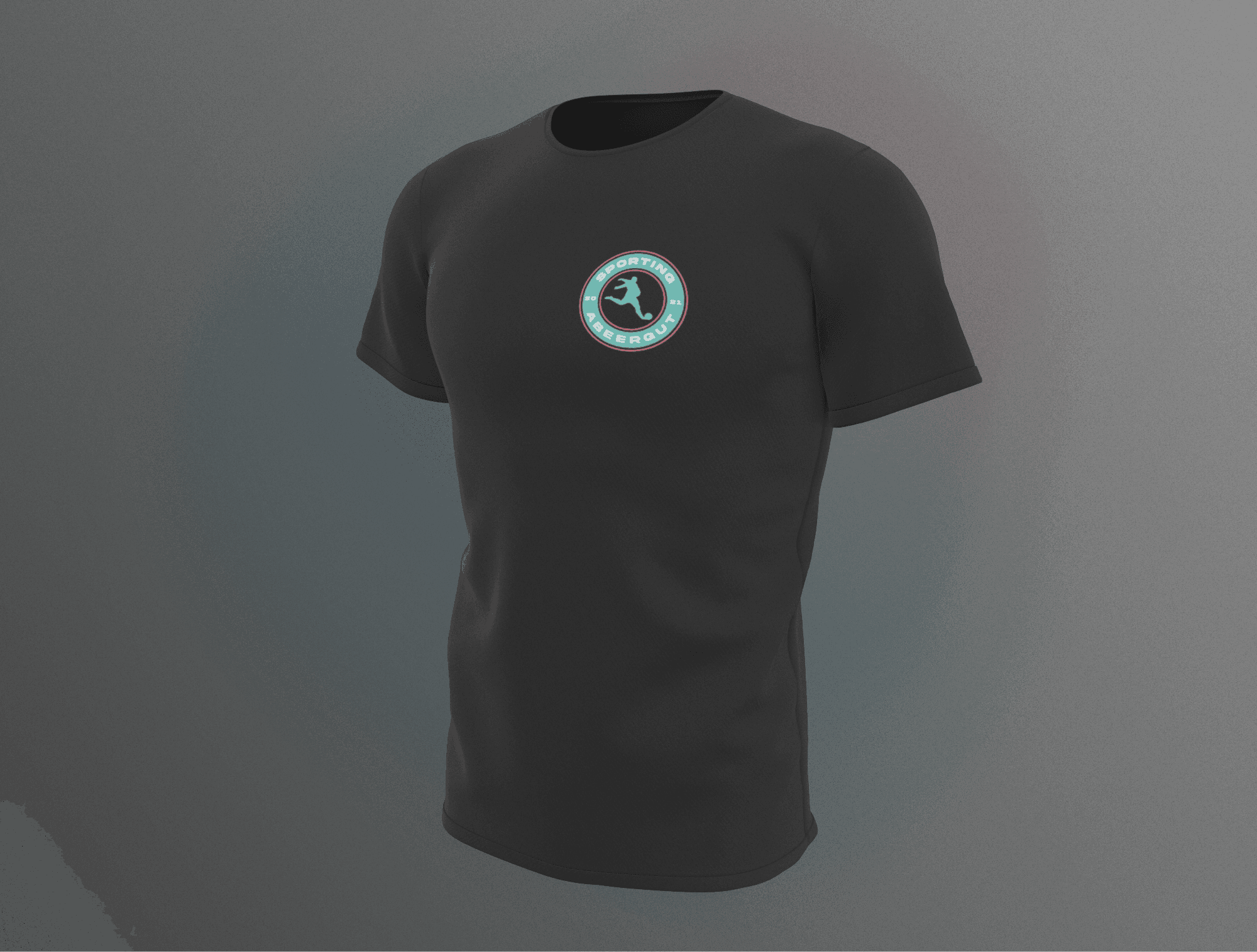
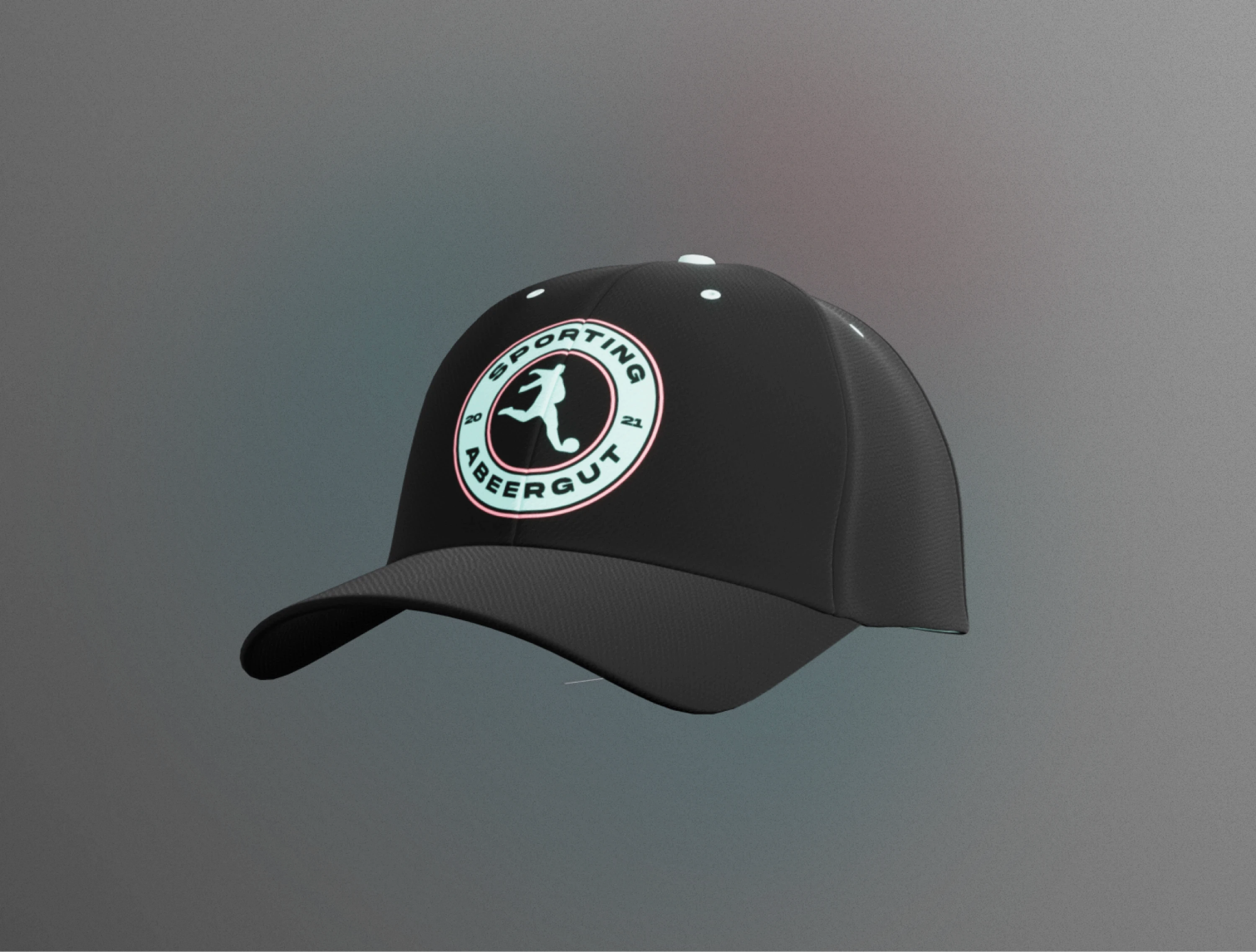
The crest went to print in 2022 and is still worn by the team today.

Printed and Still In Use

Became the Team's Public Face

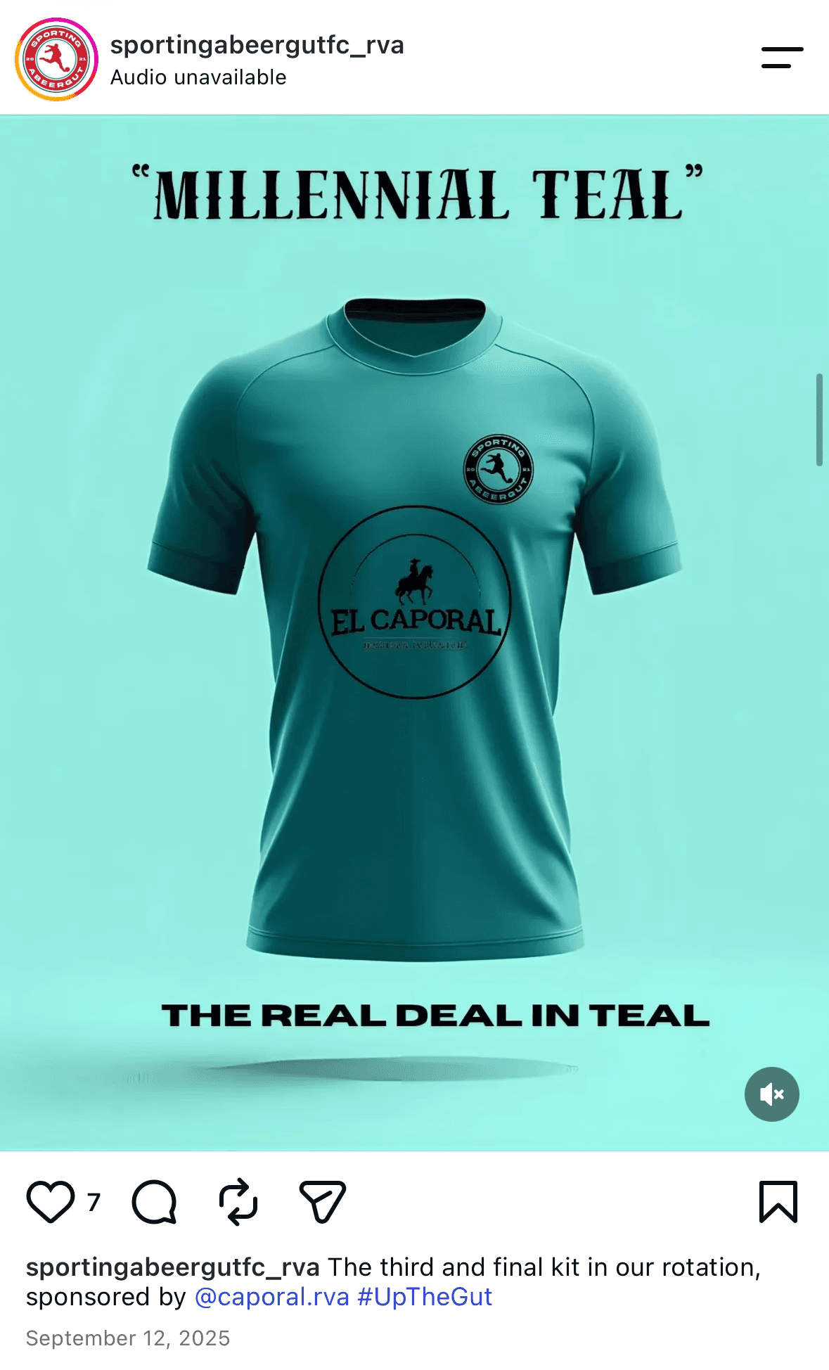
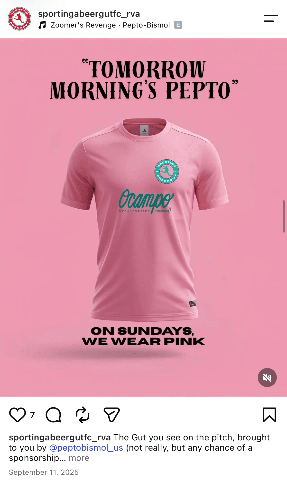
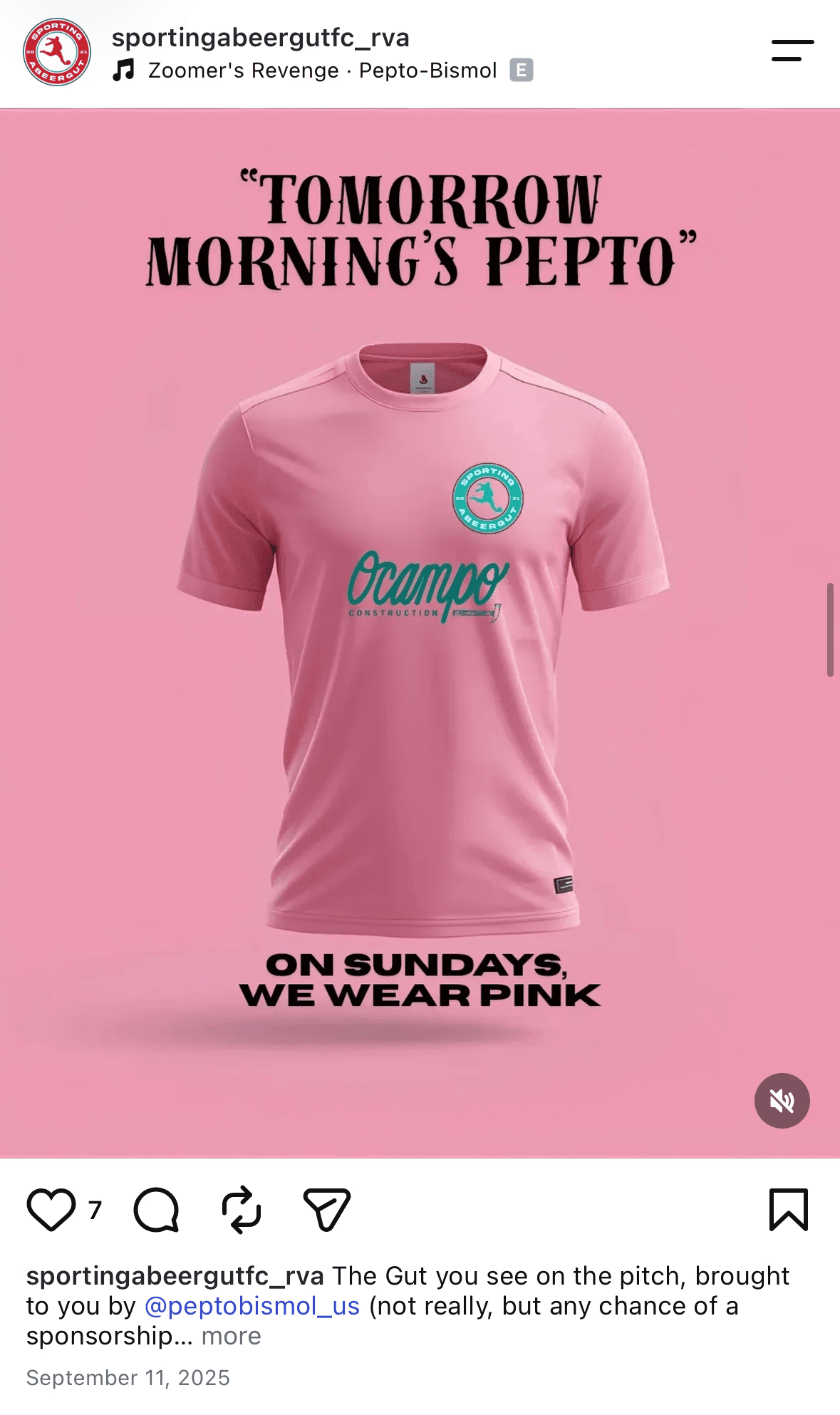
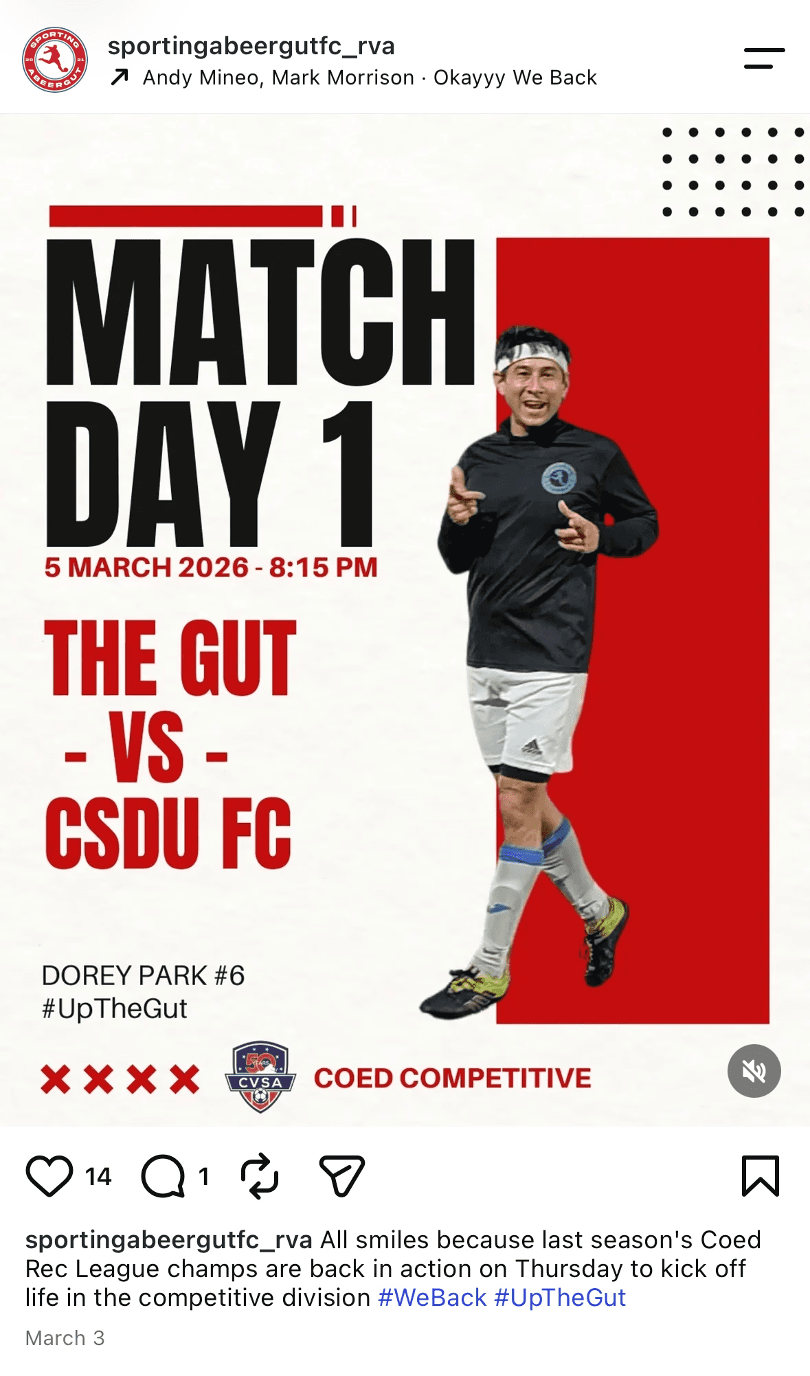
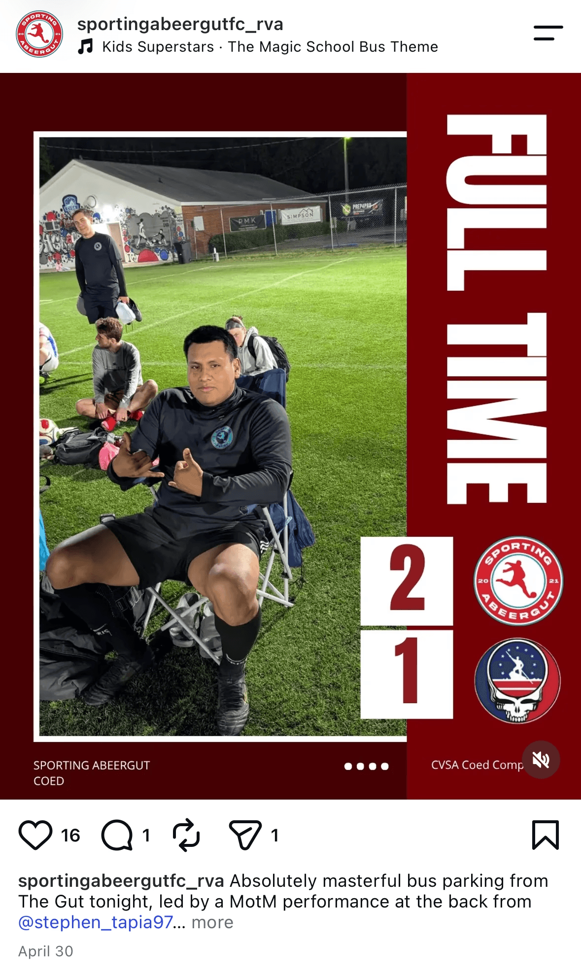
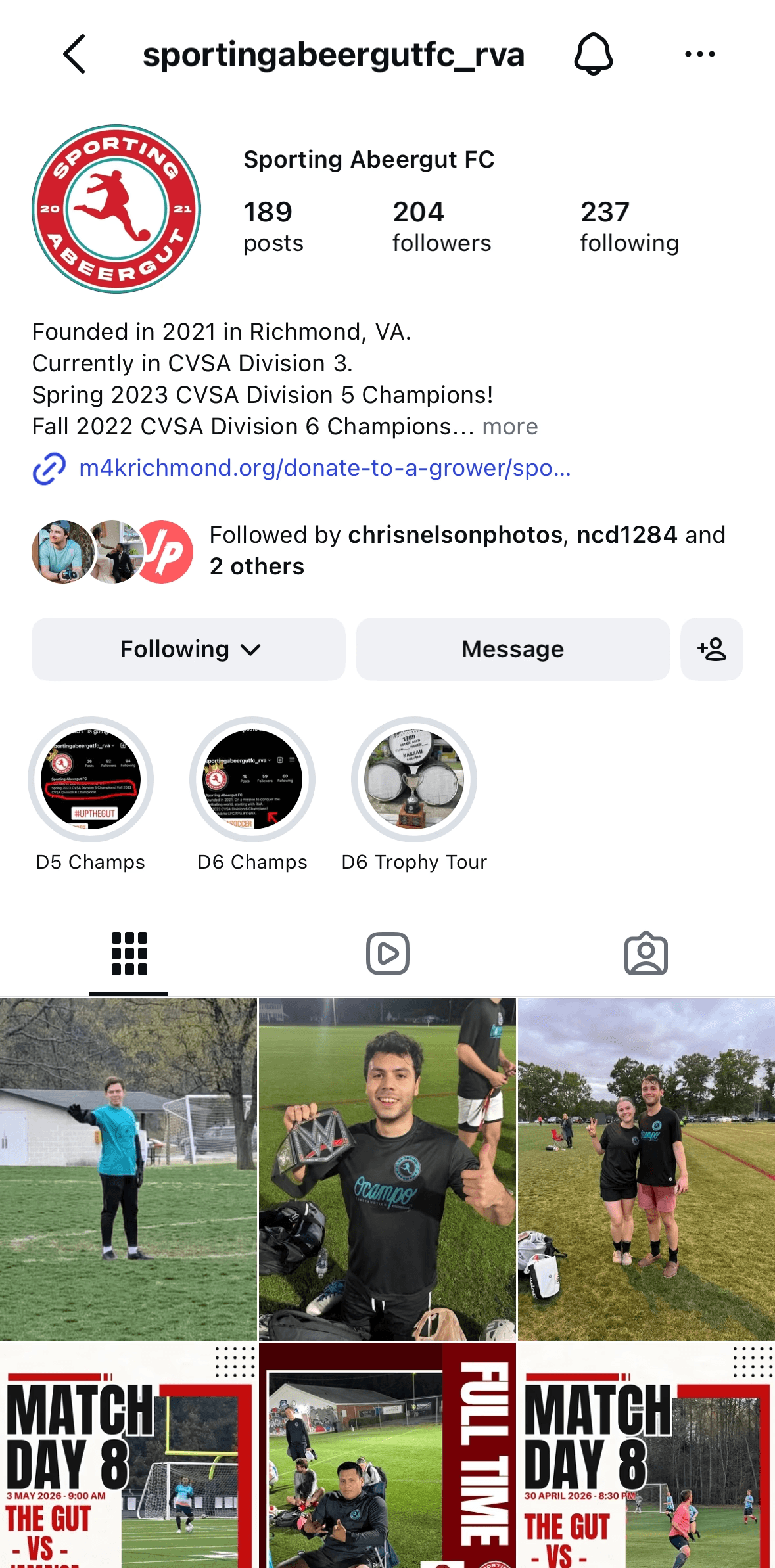
Now featured prominently on the team's Instagram, doing double duty as kit branding and social identity.

Delivered on the Goal

A badge that reads as professional at a glace, but still carries the team's own inside jokes.

HOW MY PROCESS CHANGED

DESIGN FOR THE LONG HAUL

Choice Builds Buy-In

Giving the team real options, not just a final reveal, made the logo something they chose, not just accepted, part of why it's still on the kits today.

Convention Makes Room for Personality

Grounding the design in real crest patterns kept it credible, which gave the unconventional mascot room to stand out instead of looking out of place.

Deliver for Every End Use

Now hand off includes an SVG for lossless resizing on shirts, plus a smaller, high-quality JPG and PNG built for social media.